I believe that Steampunk is more than just brass and watchparts. It's finding a way to combine the past and the future in an aesthetic pleasing yet still punkish way. It's living a life that looks old-fashioned, yet speaks to the future. It's taking the detritus of our modern technological society and remaking it into useful things. Join me as I search for items for my house that combine the scientific romanticism of the Victorians with our real present and imagined future.
Wednesday, July 29, 2009
Pictorial Webster's
My friend Kara alerted me to the imminent publication of Pictorial Webster's
I hate to just shill the publisher's pitch, but...
Pictorial Webster's -- Featuring over 1,500 engravings that originally graced the pages of Webster's dictionaries in the 19th century, this chunky volume is an irresistible treasure trove for art lovers, designers, and anyone with an interest in visual history. Meticulously cleaned and restored by fine-press bookmaker Johnny Carrera, the engravings in Pictorial Webster's have been compiled into an alluring and unusual visual reference guide for the modern day. Images range from the entirely mysterious to the classically iconic. From Acorns to Zebras, Bell Jars to Velocipedes, these alphabetically arranged archetypes and curiosities create enigmatic juxtapositions and illustrate the items deemed important to the Victorian mind. Sure to inspire and delight, Pictorial Webster's is at once a fascinating historical record and a stunning jewel of a book.
They are giving away a very fancy leather hand-bound edition, too!
Buy Pictorial Webster's: A Visual Dictionary of Curiosities at Amazon (for 34% off -- only $23.10). There's also a Pictorial Webster's Stamp Set and Pictorial Webster's Wall Cards.
Via Junior Society.
Monday, July 27, 2009
Submarine Set in Cartoon Heroes Video
Ben sent me this music video with a fabulous steampunk set -- you have to wait a while, but then you get a hybrid spaceship/submarine straight out of Jules Verne.
I didn't expect to like it, but I loved it!
Saturday, July 25, 2009
20th Century Props Auction
Cherie sent me this:
20th Century Props seems to be closing it's doors with a humongous webcast auction of it's warehouse July 28th - August 1st.
When 20th Century Props decided they had
enough, Great American Group was chosen to
sell everything down to the bare walls. With
over 40 years of collecting and buying, renting
and selling, Harvey Schwartz, the owner of 20th
Century Props is ready to retire. You’d be hard
press to find any movie or television show that
hasn’t had one of these props on the set. You’ll
find the futuristic shower Tom Cruise used
in “Minority Report” to an armchair that starred
with Marilyn Monroe in multiple films to the Art
Deco chandeliers from “The Aviator” &
“Titanic” with Leo DiCaprio. Whether you are a
movie buff, a collector, an interior decorator ar
just a person with a thing for leopard skin
furniture, you’d be crazy not to attend this
auction. Bid on site or bid online from the
convenience of your PC! Log onto our website
at www.greatamerican.com and view over
200,000 square feet of furniture, collectibles,
antiques, figurines and artwork from every
period in the history of the world.
There's a Windows Media video tour here and a pdf brochure here.
Some advice here? No 6 foot high statues of anything (unless you have 20 foot high ceilings, and then only maybe). Stay away from fiberglass. Focus on the furniture and housing accessories -- it looks like they have some great antiques. Your best deals are probably on the earliest and latest auctions each day -- when people haven't warmed up yet or have already spent their money. Remember, there's a 10% buyer's premium and if you don't live in LA you've got to figure out how to get it home -- and freight shipping is probably not cheap.
Friday, July 24, 2009
Heather Jean's Steamy Horrorpunk Home
Heather Jean is an artist who specializes in wierd, wonderful, horrible collages. She also has a fabulous home to share with us.
Although I would consider myself more horrorpunk than steampunk, I think you can see the influence on my decorating... The first 2 pics are in my living room, that's a radio tube stuck in an antique candle holder, a photo of my spouse and I at Dances of Vice last year, and a fetal skeleton replica which was altered by my friend Mike Locascio to look like one of the dancing fetal skeletons of Bologna. I'm an artist and I work at home, so I've really enjoyed creating an atmosphere to suit my eccentric and esoteric tastes.
Wednesday, July 22, 2009
Martin's Watchmaker Loft
Here's Martin's loft; he says he's
...more oriented towards a Sherlock Holmes interior with strong watchmaking influences (my grandad was a watchmaker).
The apartment is a loft in a renovated toy factory from way back. Because of some of the interior features of the building such as the enclosed courtyard, we sometimes call it the Willy Wonka Building. Now if I could only get that fully surrounded double height shelved library going!
I love the personal history informed view of his steampunk style -- "the watchmaker." Did you notice the shelf full of timepieces?
Tuesday, July 21, 2009
Maeve's Apartment
Remember Maeve? She was looking for advice on decorating her apartment about a year ago. She sent me some pictures of how her mainly-elbow-grease-fueled project turned out, although I'm very late in getting to them.
Here are a few pictures a month in to trying to decorate my apartment. Most of the pictures are of the kitchen, since that's the room we've made the most progress on. One of the biggest, simplest, cheapest changes was the kitchen cabinets--we simply taped a few inches from the edges with electrical tape and it looks like an entirely different kitchen. One of the other cheap, simple projects I'm proud of is the kitchen hutch, which started life as a terribly ugly mid-nineties light wood finished thing, and a couple of coats of high gloss spray paint and white spray paint on the knobs totally turned it around (not to mention it adds a lot of storage in my teeny tiny kitchen). The hutch was $30 at the thrift store and the spray paint was five dollars.
The other big, cheap, (relatively) easy DIY we did was reupholstering two chairs and an ottoman (second ottoman to follow soon). The chairs were $20 each and the ottomans $5 at the thrift store, plus fabric for everything came to about $60. My boyfriend and I weren't sure that we were going to be able to do this properly, because neither of us had any experience with reupholstery at all, but it really wasn't that bad.
Monday, July 20, 2009
Mark Phenicie's Home and Furniture
Mark Phenicie sent pictures of his home, and of furniture he designs and builds.
One day, back in the early 70’s after I had returned home from Traveling Trough France, Italy, Living in North Africa for a year and going through Israel, India, Thailand and living a year in Vietnam as a young Marine, I decided to set out to build some of my own furniture with my own designs. I frankly could not understand why we as Americans who had access to the most sophisticated tools could only turn out what I called “Sears $49.95 junk furniture, whereas in the poor countries they were turning out detailed masterpieces.
Although my furniture was influenced by my exposure to other designs i had come in contact with,it slowly evolved and was not patterned after any particular artist even though it was a combination of ideas that I pulled out of my head and were pleasing to my eye. My living room today still maintains that original design which I labeled “the Spiral design” or “the Open helix” based on the DNA chromosome and or vine festooned trees. This design was popular with traditional English furniture known as the “sugar Barley twist” or some of the Flemish or Spanish furniture designs using the open barley.
My "steelchair53" line of furniture has evolved from a slab of rough sawn oak which was taken from a barn loft stash from a friend of mine. In the process i designed and made a large desk and a chair that matched, with a sofa and lamps and coffee table which will have end tables to match. this furniture smacks of "Steam punk", "Mad max", "Post Man, Water World and a smidgen of Dinatopia.
See the whole set, with some amazing furniture pieces (including a $3000 birdhouse), here.
Sunday, July 19, 2009
Simon's Steampunk-Without-Knowing-It house
Simon, like many of us, had never heard the term steampunk until recently, although had loved elements of it's style for a long time. (I find explaining steampunk to be hard, but not nearly as hard as trying to explain my desired style without having the benefit of a "genre" or "subculture" to help.)
He's done a great job with his home even without the benefit of the word. I can't wait to see what he does now that he knows what steampunk is!
Saturday, July 18, 2009
The Week of Readers' Homes
I'm declaring this the week of readers' homes -- because you guys rock, I've got tons of DIY steampunk inspired decor to share.
If you have some photos to share (and haven't emailed me already -- I'll be looking through my long list of "to post" emails to find the ones I haven't gotten to), feel free to comment below.
Eva's Steampunk Naturalist Living Room
Eva posted a link to pictures of her living room in the comments to Decorating the Cabinet of Natural Curiosities, and I thought you all might be interested in seeing what she's done.
My take-aways: Apothecary jars are key to the "Victorian Naturalist Laboratory" look. (And there have been so many in stores over the last couple of years they are starting to show up in thrift stores -- I scored a smaller pedestal one just yesterday.) Uncluttered is good (a constant tension in steampunk decor). I do think the room would benefit from a bit more organized clutter on the walls -- maybe some Haeckel prints to play up the unsweet side of our naturalist?
See her whole set of pictures, including before and afters, here.
What would you fill apothecary jars with?
Apothecary jars + apothecary style media cabinet -- it's obvious when someone else does it, isn't it?
I love the fern leaf taking up the length of the shorter apothecary jar.
My husban Ben has been wanting an old typewriter -- Eva found this one for $15 at a junk store! She's planning on filling the jars with old keys and gears.
My take-aways: Apothecary jars are key to the "Victorian Naturalist Laboratory" look. (And there have been so many in stores over the last couple of years they are starting to show up in thrift stores -- I scored a smaller pedestal one just yesterday.) Uncluttered is good (a constant tension in steampunk decor). I do think the room would benefit from a bit more organized clutter on the walls -- maybe some Haeckel prints to play up the unsweet side of our naturalist?
See her whole set of pictures, including before and afters, here.
What would you fill apothecary jars with?
Wednesday, July 15, 2009
Decorating the Cabinet of Natural Curiosities
If you've been wondering how to build a room around the Artforms of Nature prints I posted a while back, here's two good examples from decorator S.R. Gambrel.
This powder room in Gambrel's vacation home is papered in pages torn from Albertus Seba's Cabinet of Natural Curiosities.
The unidentified botanical prints in the living room above make for a surprisingly modern and colorful space.
I want to use a lot of the Artforms of Nature prints in our new office... neither of these is quite what I'm going for, however. Anyone else have any images or inspiration for a good Victorian naturalist laboratory (that's pronounced "la-bohr-a-tory") look?
Monday, July 13, 2009
More Nixie Tube Clocks
A great post about nixie tube clocks, with a very discerning eye for fabulous designs.
Thanks, Tangelia!
Saturday, July 11, 2009
211 Elizabeth Condos
Roman and Williams (previously featured in the post on the Practical Magic House) are so incredible I may have to do a series of posts of them. Here's some shots from a project called 211 Elizabeth -- a built from the ground up set of brownstone condos in Nolita.
A dramatic wall of 9 foot high glass doors—with true divided lights and transoms—intersects the living room and dining room. Every living room has a large wood-burning fireplace. The floors are walnut herringbone parquet, and the baseboards, casings, windows and doors are trimmed in Roman & Williams’ favorite high gloss black oil paint by Fine Paints of Europe.
Although transom lights and herringbone parquet may be more than you can swing for your house, high gloss black paint on the trim is an easy update. (I'm using this approach in my addition -- we'll see how it looks....)
...vanities are painted a high gloss cream and feature double mirrors, double sinks and patinated brass fixtures. Walls, floors, and vanity tops are fashioned from slabs of Calacatta Gold marble detailed by acorn topped brass headbolts.
This is a lot of marble, but white vanities topped with marble are easily found. Antiqued brass fixtures aren't common yet, but I found a couple of options through the big box retailer's special order programs for my bathrooms.
...all shelves with glass fronts are framed in walnut and painted by hand with high gloss black oil paint. Counters are rendered in Danish oiled wood.
I don't actually like these cabinets, but check out the floors. Walnut herringbone! Gorgeous. And the squared off lighting adds another geometric touch.
These are just renderings, but I'd love to see some real life pictures of these homes.
What do you think?
Thursday, July 9, 2009
Art Donovan's New Wall Lamp
Art Donovan has a new wall sconce:
It's hard to see here, but the interior of medallion on the left rotates, with some fancy blue light phasing in and out.
What I want to know is what material Art used for the gold mesh caging -- remember, this is the man who has used slinkies in his designs before.
Nice work!
It's hard to see here, but the interior of medallion on the left rotates, with some fancy blue light phasing in and out.
What I want to know is what material Art used for the gold mesh caging -- remember, this is the man who has used slinkies in his designs before.
Nice work!
Tuesday, July 7, 2009
Tonight: Steampunk Gadgets in Warehouse 13
This just in...
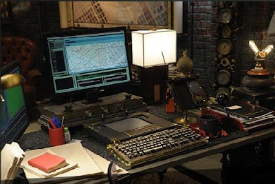
SyFy (formerly SciFi) Network's new show Warehouse 13 -- X-Files crossed with a warehouse full of antique supernatural gadgets -- premieres tonight (and Datamancer has a keyboard featured!).
Read about it here. See more gadgetry pictures here. There seems to be a nice Victorian house involved, too.
If you watch it, let me know what you think. And if you figure out how to watch it without cable, please let me know!
Monday, July 6, 2009
9 The Movie
Automata (or golems -- it's hard to tell if it's magic or science that created them), mad scientist creator, the obligatory airship, post apocalyptic. It's nicely dark and grungy. It's 9 The Movie.
There's some good mad scientist bits here:
http://www.filminfocus.com/focusfeatures/film/9
I'm looking forward to more of the sets.
There's some good mad scientist bits here:
http://www.filminfocus.com/focusfeatures/film/9
I'm looking forward to more of the sets.
Saturday, July 4, 2009
Kozo Lamps
David sent me this find -- some wonderful, industrial, lamps by kozo lamp. (And we love lighting, don't we? Sometimes I worry that I post *too* many lighting options, but then decide, "nah, stylish electricity is the easiest way to steampunk a house.")
Here's what the makers have to say about the lamps: “With a bit of humor and a certain audacity, KOZO lamps stand as alien lighting figures, telling a new story”
KOZO lamps are made out of galvanized iron plumbing tubes, hand picked and collected from different manufacturers. each bares the trademarks of its origin.
The materials are left as authentic as possible with a little rust at the joints and some marks from hand tools that were used in the assembly process.
Kozina
Thursday, July 2, 2009
Practical Magic's Victorian Apothecary
Did the phrase "Victorian Apothecary" get your attention? (Or maybe just the fact that I'm posting after so long a hiatus while working on the renovations to my house?)
This is the kitchen from the 1998 witchy-fun movie, designed by the duo of Robin Standefer and Stephen Alesch, who went on to create wonderful real houses under the umbrella of their design firm Roman and Williams.
From the Practical Magic website: The New England-style home also features a roomy kitchen -- the heart of the house -- which centers around a British aga-gas stove.
"The aga is almost like a shrine," elaborates Standefer. "This is the place where they do their work; it's where they place the caldron."
The pantry features shelves of home-canned foods -- the kind of thing past generations of women used to spend their days filling which now fell to members of the prop department, who had to fill hundreds of jars.
Standefer sees the house as being a very real character in the story. "The house itself has a certain magic to it. There is a whole world in this house and garden. These women are outcasts and this place is their sanctuary; it almost feels as though all the emotion of the generations is caught up in its walls."
Although the wonderful transom windows above the doors would be challenging, approximating this look wouldn't be hard. Stick to a palette of whites and woods, use a mixture of dark and white glass fronted cabinets (Ikea's LIDINGĂ– and LILJESTAD would work) and accessorize with glass cloches and apothecary jars.
Hat tip to Barefoot in the Orchard and Endless Inspiration.
Subscribe to:
Posts (Atom)