Wednesday, October 31, 2007

Happy Halloween: Necromance for your Home

I've been saving this for Halloween. For all you mad (or not so mad) scientists, Necromance has some wonderful old fashioned scientific supplies.

I liked this hot plate of a skeletal hand:


Pigeon Skeleton:


Turtle Shell:


Anatomy charts:


Plenty of other good things, including specimen jars and vials (these would be great in a kitchen -- or full of scary things on a mantel). Many are quite dark. Their prices are quite reasonable -- where else are you going to get a full size plastic replica of a skull for $36?

In addition to their website, Necromance has two storefronts in LA. Both look like lots of fun.


Other shopping posts.

Tuesday, October 30, 2007

Peter Tansill Sculpture


It's amazing when you start looking, what you find and where. I was bowled over to discover the artwork of Peter Tansill in Göreme, a small tourist town in the Cappodocia region of Turkey. We had to fly 15+ hours to find a steampunk artist who just happens to live in Virgina...


Anyway, take a look at his work. He calls it "Compositions of Sculptures with Found Antique Objects." I think the arty word for it is assemblage. While he doesn't use the word steampunk, it's full of old dolls, military references, and reused industrial and mechanical parts. This is what I think a steampunk automaton should look like.


Peter said to mention that most of his work is for sale -- you can contact him via his website.

More art posts.

Sunday, October 28, 2007

Steampunk Room Plans by Faryndreyn

Tinkergirl was so kind as to send me a link to these wonderful "plans" developed by Melissa Koch/Faryndreyn on deviantArt


Gear Up Cafe by *Faryndreyn on deviantART

The Gear Up Cafe -- It's like someone from 1890 time traveled to the 50s and brought the traditional diner concept back.

Speaking of time, doesn't the clock at the end of the space just work? Want to do something similar? I found a seller on Ebay who makes a couple varieties of 48" clocks (which means it can be done...).


There's a similar 40" clock available online:


Her second room is a boy's room.


Boy's Room by *Faryndreyn on deviantART

It's a typical boys room -- dirty laundry and all -- but it just happens to be on an airship. I like all the references to pirates, robots, and aliens -- this is obviously an airship that travels between the stars.

TinkerGirl spotted the inspiration for the robot on the right -- do you recognize him? It's Tik-Tok who first appeared in L. Frank Baum's Ozma of Oz book.

Great job, Faryndreyn. You have a knack for taking the commonplace and making them steampunk. (Which is, after all, what this blog is trying to do as well.)

Friday, October 26, 2007

Airship Fantasy Room

I keep imagining a room made to evoke the feeling of an airship. There are lots of different ways you could do this, from a 1930s cocktail lounge feel that just happened to be suspended under a baloon to a sky pirate ship. What I'm thinking about, however, is more structural. How can a room feel like an airship? I didn't start with the question, but I keep stumbling over things that would work well, and since I don't have an actual room to decorate I'm doing to decorate an imaginary one here.

First, furniture.
The Balloon Chair at Horchow.


Gondola Day Bed. This is one of my all time favorite pieces.


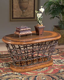
"Basket" like Cocktail Table.

Lights

These lights at Pottery Barn look like something you'd use in WWI to spotlight airships in the sky, don't they?


They come in a variety of sizes and shapes -- tabletop, spot, and task.

Walls

This is the hard part. I'd consider this Balloon WallPaper.


But it might be a bit kitschy. Perhaps some seagrass wallpaper wainscoting, to evoke the gondola of a small balloon, and then perhaps paint the walls sky blue (with clouds?) above the chair rail.

Don't forget airship posters.


Finishing Touches

I like the idea of a compass on the floor.


These playing cards on the table.


And a stormglass hanging on the wall.


There. Now that I've gotten that out of my system I can return to daydreaming around rooms I actually have.

Thursday, October 25, 2007

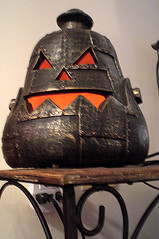
Steam Pumpkin Rides Again


Steam Pumpkin Rides Again
Originally uploaded by Cherie Priest
Unfortunately unattainable, as the owner found this happy automaton (I think he looks happy, don't you?) at a Walmart years ago and hasn't seen anything like it sense.

Wednesday, October 24, 2007

Art Nouveau -- and my 100th post!


This is the 100th post to The Steampunk Home, and I spent some time to find something appropriately festive for such an auspicious occasion: Art Nouveau.

You probably know by now that my idea of a steampunk home is not one that is trapped in the Victorian era, but one that embraces the Victorian era but builds into an imaginary future from there. In reality what this means is that I like Art Deco and Art Nouveau, too.

Art Nouveau was a shortlived artistic movement (1890-1914) between the Victorian era and Art Deco. The introduction to Art Nouveau at the National Gallery of Art's feature on the era (a must read) does a good job introducing us to the influences of Art Nouveau: Many artists, designers, and architects were excited by new technologies and lifestyles, while others retreated into the past, embracing the spirit world, fantasy, and myth.

Art Nouveau was in many ways a response to the Industrial Revolution. Some artists welcomed technological progress and embraced the aesthetic possibilities of new materials such as cast iron. Others deplored the shoddiness of mass-produced machine-made goods and aimed to elevate the decorative arts to the level of fine art by applying the highest standards of craftsmanship and design to everyday objects.

I think this line sums up why it has an appeal in steampunk: excited by new technologies and lifestyles, while others retreated into the past, embracing the spirit world, fantasy, and myth. Isn't that basically the appeal of steampunk? A tension with modern technology and a attempt to deal with it through fantasy? Art Nouveau taps into that fantastic aspect of Steampunk I've talked about earlier.

My favorite architect, especially for interiors, is Victor Horta. The stairway above is from the Horta designed Hotel Tassel and the interior below is from his own house. Both from Victor Horta by David Dernie and Alastair Carew-Cox.


Getting the Look

I found three good articles on decorating in an Art Nouveau style:
The Art Nouveau Home (thanks, Doc Sinister!)
BBC Homes page on Art Nouveau
Home Decorating Ideas -- Art Nouveau


Original Art Nouveau Tiles are available from around US$150. You could use one or two as a centerpiece of a bathroom tile project, or framed on a wall.

I find Art Nouveau furniture relatively easy to come by (and suprisingly affordable) at my local auction house, and I suspect any place that brings in containers of antiques from different countries (England seems to be the best) would have similar goods. In my house we have a sideboard and a shelved wardrobe with Art Nouveau styling. A recent auction had these pieces:


Art Nouveau stencils would be an affordable way to add some style to your walls. I'm also currently lusting after this wallpaper dado for underneath a chair rail (available at Cumberland Woodcraft and Design Your Wall).


If you need doo-dads (ahem, accessories) Past Times has some nice reproductions, including these metal pieces.

So I hope you enjoyed the Art Nouveau eye candy. Thanks for sticking with this blog for 100 posts -- and here's to the next 100!


Like this post? You might also enjoy:
Casa Battló
Steampunkish Design Templates
Edison Bar
(Thanks to Doc Sinister for recently suggesting Art Nouveau as a post topic.)

Monday, October 22, 2007

MakerFaire Austin

The family and I went to Maker Faire Austin this weekend, and while the Neverwas Haul did not put in an appearance, there was still some steampunk goodness.

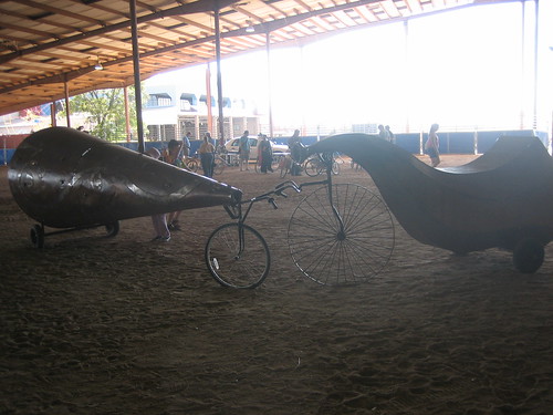
Two art-cycles. The one on th left was covered with music box mechanisms. I love how the one on the right looks like a Victrola.


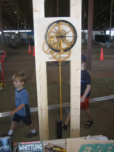
Wooden Gear Clock, from Scrollsaw Magazine. (We picked up a copy of that issue, if you really want to make one.)

Douglas Little, Modern Alchemist


I've talked about Douglas Little before (and, indeed, I burn his Tincture of Winchester candle on my bedside table), but as we approach Halloween I thought another look would be appropriate. Mr. Little isn't steampunk -- rather a Modern Alchemist, a Purveyor of Curious Goods, and an Edwardian Dandy -- but he shares many steampunk sensibilities.


The best part of his website is the Press section -- if you poke around you'll find the two spreads he produced for House and Garden. They are full of wonderful things, arranged in a luxurious and opulent way.

Wednesday, October 17, 2007

Lab Glassware

Aesthetically, lab glassware hasn't changed much in the last 100 years. (Borosilicate has been around since the 1890s.) Why does this matter? Well, that means that lab equipment is the one place where steampunk decor overlaps with the ubiquitous modern decor. We like it because it evokes the scientific romanticism of the Victorian era. Modernists like it for the clean lines and clear glass.

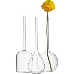
What this odd coincidence means is that there is a lot of innovative chemistry lab equipment based decorative items out there for some very fair prices. I ran across a surprising nice set at CB2, the "little sister" of Crate and Barrel, which features affordable modern furnishings.


Teardrop and Bottle Hanging Vases, $3.95 each


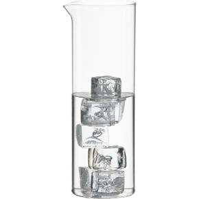
While I've browsed a lot at the large scientific supply houses for chemistry glassware, I've just ordered everything on this page because it *doesn't* have the ugly modern trappings that many (but not all) of the professional gear has -- plastic stoppers, painted on measurements, etc. The prices are also quite fair when compared to the supply houses. If you'd like to do your own comparisons, check out Cynmar, Delta Education, and Indigo.

(disclosure note: I don't make any money off of these particular links, but my Amazon and Ebay links are affliate links.)

Test Tube Vase Project


I ran across this project on Curbly the other day. It's simple, easy -- I like projects that could be done in an afternoon or less. It's based on a stainless steel design on Sprout Home, but I think Chrisjob's version is closer to Steampunk. I think I'd stain the wood a dark brown to get a more Victorian feel.

With a little more work, you could extend Chrisjob's plans to a larger wooden test tube rack -- for spices or flowers:

Tuesday, October 16, 2007

Austin Steampunk Party

Mr. Brumfield and I attended a very charming airship party this weekend. Her Majesty's Ship Rapture was full of colorful characters -- airship pirates (allowed on, I understand, because they were the only ones with a map to our intended destination), mad scientists, automata, doctors, colonels, engineers, ladies and "ladies" -- we had a lovely time. Since I imbibed a bit too much of their patented elixir, I forgot to get any "daguerreotypes" of the decor but the Baron has been generous enough to share one of his with me.


This is the first class cabin (if you can't tell from the occupant -- a beautiful dancing automaton) which was very luxurious if a bit risque with it's red upholstery, a hookah pipe (out of sight), a writing desk, bookshelves, and a lamp that added a touch of the fantastic to the whole proceedings.

The crew quarters was more rough, with salvaged equipment that led one to doubt the stability of the engines, and science experiments that glowed, squirmed, and made one quite tipsy.

Mr. Brumfield and I went as engineers with the railroad in the American West -- saved us from having to maintain English accents, you know -- and allowed us to sneak on board with our weapons (side rule, level, pocket scale, stopwatch, and many pocket watches) which the lax security decided did not qualify as weapons of mass destruction. (Silly them.)

Our thanks to the sinister Doc Sinister, the Lovely Mdme Rosamund, and Lady Lucrezia of the wonderfully cast resin trilobite for a lovely event.

Friday, October 12, 2007

Ebay Auction of 1895 Foundry pieces


There's an interesting auction going on over at Ebay -- of a foundry built in 1895.


King Cotton says We are fortunate to have obtained over 5,000 foundry patterns from the Glover Machine Works, in business since 1895 and was closed last year.


I don't know much else about it, but there are a lot of neat things that I think are very steampunk.

Glover Machine Works Listings on Ebay

Tuesday, October 9, 2007

Interview with Andrew Meieran of the Edison Bar


I promised you a while ago an interview with the Edison Bar designer. It's taken a while to pull together, but here it is! Andrew Meieran is a principal of the Edison Bar, and its designer. According to his bio:

Andrew Meieran cultivated his love of historic properties while studying architecture, film and history at UC Berkeley. During his freshman year, unable to win a spot in the dormitory lottery, he purchased a dilapidated craftsman bungalow. Andrew spent the duration of his college career pursuing a parallel curriculum: a self-designed, self-taught, experiential program in home restoration. After graduation, he used that experience to launch a career in real estate, believing that adaptive reuse of historic properties held the key to both creative and financial independence.

It goes on to list the many, many projects he's been involved with.

Andrew was gracious enough to answer some questions for us, so without any further ado:

SH
: Tell us about the space? What's the history? Where is it? What was it?

AM: The space was originally a state of the art power plant. It was built by Thomas Higgins, a copper baron from Arizona who wanted to build the most advanced building in Los Angeles at the time. He wanted high speed electrical elevators, filtered water, electric lights, and every modern convenience. Unfortunately, this was 7 years before LA’s power system was set up. Thus, he built the entire plant in the subbasement of the building. He chose a site in Downtown Los Angeles in an area that later became known as Wall Street West, and envisioned it as the center of a new modern downtown. City Hall was built just one block away in the 1920’s. The building eventually housed offices of such people as Clarence Darrow and even the Temperance Society who led the fight for Prohibition

SH: What came first, the space or the idea? Were you planning on putting a bar here, and came up with this or was this the bar you'd always wanted to create?

AM: I have always been looking for spaces to place a unique lounge. I’ve wanted to build the place I always imagined existed and something that would blend all my favorite styles and design elements. All the real lounges have always been less than what I’d hoped for. I wanted someplace that could have been in the world of Blade Runner or some mysterious past or future world. I wanted a romantic and nostalgic space that looked back at the exuberance of the past (the industrial opulence of the industrial revolution and 1920’s in particular) as well as the future of technology and invention. I saw this space (under several feet of water!) and noticed pieces of the industrial past peeking out, I knew immediately that this was the place I wanted a lounge. It was a perfect mixture of Jules Verne, industrial decay; a peek into the past with a hint of their vision of the future.

SH: What artifacts were already on the site to work with? Did they have to haul in the furnace, the dynamo, etc or were they already present? (Stefan Freestate via Brass Goggles Forum)
How much of your electrical equipment is original? Did you move it around or is it in the same place as it was originally? What are those round things? How about the "end tables" on the dance floor -- those look much more 1950s than the rest of it.

AM: All of the steam boiler itself is original and intact. We mainly cleaned it up. The rows of generators are still where we found them. They are not the ones put in in 1910 when the place was built, but were actually replacements from the 1920’s, 30’s and 40’s. We also cleaned them up and made them accessible. Some of the old steam tank equipment and piping is also original, but moved in order to allow access and layout. The big round things are pieces of the old generator turbines that we cut in half and made into sculptural pieces so you can see both inside their working and interact with them. We made additions to the space (like the main stairway that descends from the entry and the forty foot mural) that complemented the feel and felt like they could possible be parts of the original space. The DJ booth is the base of the original smoke stack and gangway that accessed the boiler. The bathrooms and bar areas are all new, but capture the flavor of the eras and past uses of the space. When it came to furniture, we looked to find (or produce) reproductions of furniture from 1910 through 1940. Some are reproductions of railway station chairs. Others are from lounges in Wiemar Berlin. Some are from Paris. The stuff that look like the 1950’s are actually reproductions from the 1930’s, from an exhibition of furniture from what I understand. It shows how much ahead of their time they were.

SH: You manage to blend a number of styles -- Victorian, Art Deco, Art Nouveau, Gothic -- successfully! How did you pull that off? What advice do you have for others who'd like to do the same?

AM: I have always loved Gothic and Art Nouveau and have been drawn to these eras. They seem the most romantic—where people were celebrating life and the mysteries of the unknown. The Gothic revival movements of the 1920’s started to blend the two and it almost feels like the result was Art Deco. They all overlapped from about 1890 on, but as each defined itself, I think it became clear that they were all descendants of the same way of viewing the world. There’s an exuberance in the designs that explore how man and nature interact—which seems indicative of the conflicts and legacy of the Industrial Revolution. The main point is that all of these elements grew out of the same exploration of the environment and they seem to me to blend naturally in one space for that reason. I utilized the Art Nouveau in the ground floor and restrooms because both seemed closer to nature (natural light, water) while the Art Deco and Gothic lent themselves to the descent into the industrial underworld. I particularly love the integration of the different styles because they actually also tell a story as you explore the space. They are like ghosts from different eras—each engendering a different feeling and mood, but all taking you on a journey through the past. You can see the layers of life that have inhabited the place and imagine the generations of laborers, industrialists, and craftsmen who were once there. You walk through the front doors and through the looking glass.

SH: Where'd you find your materials -- furniture, fixtures, draperies, etc? Can you give us any pointers for sourcing similar things? ( i.e. if it was salvaged or scavenged, from where? if new, what sources did you use or how did you find things that fit in a world that is full of midcentury modern?)

AM: Most of the pieces are from salvage yards and even (dare I say it) Ebay. I’d find industrial components and use them in ways that they hadn’t been used (the hundreds of glass electrical insulators that make the chandeliers for example). There is so much great design in things that have no current use, like old industrial machinery, that you can get them cheap (if you can move them!) I ended up having to custom design most things from pieces or from photographs for reproductions. It’s amazing what happens when you walk through a flea market or antique shop and start looking at things purely for their design and forget everything about their functionality. You suddenly notice that a metal bracket (for $4) would make a great lamp if you added electricity, or a chunk of metal would make a great table if you could find someone to grind of one or two brackets. One of our greatest finds were the old pressure gauges and fuel indicators that I fell in love with when I saw them but didn’t have a need for. They were metal brackets with glass tubes. With a light in each, they became the sconces through out much of the space. They were cheap, but they weighed hundreds of pounds. But I think they are beautiful and feel like they could have been part of the original power plant.

SH: Did you know you were building a -- excuse the phrase -- steampunk temple? Did you even know what steampunk was when you were creating the Edison Bar? How were you introduced to the concept of steampunk?

AM: I had never heard of Steampunk before. Someone said something about it about a week after we opened. But I have always loved the aesthetic. I love Jules Verne’s images of industrial Gothic. I actually lived for a year in the bell tower of a catholic church (no joke) that I was rehabilitating which suited my gothic tendencies. With The Edison I always felt I was building an industrial cathedral. It was a pleasant surprise to find out that I wasn’t alone and that once I built it, others would appreciate it. People have said to me that they had also wished such a place existed outside of the movies and literature. The response has been so astounding that I’m hoping other people will start integrating all these design elements into their work and bring a sense of the romance of design back. All the ubiquitous design over the last few decades is so depressing. You could go to a bar in New York of all places and it looks like it could be just like a place in Iowa. People need to utilize their imagination to take spaces and integrate the history of the location and the architectural artifacts into their own vision of the future. They can be light and dark, opulent and sparse; I’ve never met anyone who could be embodied in a single aesthetic. Thus spaces should reflect the idiosyncratic nature of those who inhabit them. They should be combinations of their dreams, fantasies, and identities. Steampunk seems to do this by incorporating the spectrum of human experience—from cold industrial reality and Gothic mysticism or spiritualism, to an idealized or dystopic vision of the future. I was very happy to learn there are people out there who embrace this and want their environment to reflect how they feel.

SH: Your use of projection to add light and motion to the decor is intriguing. Where did that idea come from? What types of film do you project? Where'd you find those?

AM: The films and lighting are integral to the space. Part of it was the result of my love of silent and experimental films. They’re getting lost and no one is seeing them. I was hoping to generate interest so people would go out and look for more. It’s also the outgrowth of the era of invention. Edison pioneered the moving picture and as it evolved from the equivalent of his own 10-30 second snapshots of the world (which we show) to alternative narratives and experimental effects, the imagery became more and more beautiful. As part of LA it’s a tribute to the motion picture and Hollywood. But it’s more a tribute to the inventors who created a new art form. The earliest film is from the 1890’s and the most recent is actually Jasper Morello from two years ago. There are clips from every era in between. All reflect the evolution of film and the edge of imagination.

SH: What possibilities were there to put the machines in motion? All this industrial equipment has some neat possibilities as kinetic sculpture. (from the steampunk home reader Ben)

AM: We were going to make same of the equipment more “mobile” and even seem to work. The three problems that ended up stopping us were 1) insurance, 2) they were difficult to maintain even on the most minimal level, and 3) when we did get some working it felt a little too much like Disneyland instead of the Edison. They became less kinetic sculptural pieces than set pieces. It’s unfortunate since several of the larger pieces could be very beautiful. Some of the smaller piece still do work. Their mechanisms are still intact nearly a hundred years later. There was one piece that I was desperate to purchase that was a kinetic sculpture that looked like part of an old electrical plant. Unfortunately they wouldn’t part with it (which was probably okay since it was also extremely loud).

SH: Anything else I should have asked or that you'd like to share with us?

AM: As a note, we are hoping to become a host of the Jules Verne Film Festival that is now held annually in LA at the Shrine Auditorium. They share our exuberance—our love of history and drive for creative and physical exploration. We’re looking forward to being a part of this community as it grows. I’m hoping people take some inspiration in the works of literature, film, and even the Edison and create more interesting spaces. It’s astounding how much people can do with so little effort if they really think about it. They can create something both new and historic at the same time.

Thanks for Andrew for sharing his time and thoughts. The picture above is from eecue's wonderful set of photos of the Edison Bar.

Wild Wild West Sets

I just discovered that the promotional website for Wild Wild West (the movie) has images of the sets. They are really wonderful. It's been so long since I've seen the movie, I think I need to see it again. (Especially since I've started working on my bedroom again, with an Old West Steampunk Train + Saloon feel. Still working on it, but so far the concept includes red velvet, wood, and trains.)

The two best parts of the set:

Victorian trains (with a lab!)

the opulent gothic lair of Dr. Arliss Loveless

But definitely go check out the rest of the images.

Thursday, October 4, 2007

Can you find steampunk at Ikea?

So when I was at everyone's favorite swedish modern discount furniture store buying the chairs for Miss J's table, I wondered "could anything here be steampunk?" I found one light fixture that I thought *might* work while I was there; this Ottava Pendant Lamp (which is not listed on the website):


It doesn't look Victorian, but does have an early industrial feel.

I spent some more time today browsing the website and found some other things that might work:


There are also a couple of chandeliers, but at $60 and with modern finishes, I'm not sure they are worth it. (In the US you'd be better off at Lowe's or on Target's website.)

Wednesday, October 3, 2007

Our "modern victorian" kid's table

Ben wanted to build Miss J (Steampunk Sprog? Steampunk Spawn? I'll give in and post a picture of her in her steampunk jacket before fall is over) a play table; I, of course, wanted it to to be attractive enough to "fit" in the house.

I found this table by designer John Reeves in some home decor magazine a year or so back:

A simple, elegant twist on a Victorian table, no?

So that's what Ben and my dad built:


We found a standard table leg at Lowe's, and quartered it to make the table legs. I wasn't involved in the actual table making (involved the purchase of a biscuit making machine, which made the table more expensive than a store bought option, but Ben very happy) but afterwards it was painted with a high gloss lacquer.

(note: The chairs are from Ikea, but I thought they looked right. The rug underneath is one of our Turkish souvenirs.)

LinkWithin

Related Posts Widget for Blogs by LinkWithin